Dashboard
Corporate Sales Tracker
Analytics Dashboard is a corporate internal web application for Sales and Relationship Managers in the financial sector to track sales activity on aggregated levels.
Client
Company ABC
Tools
Framer, Adobe XD
Role
UX/UI Designer
Year
2020 - 2022
Colors
Tags
Dashboard
Design System
Corporate
Overview
The 'Analytics Portal' project started in 2020 with the aim of replacing semi-manual sales reports in Excel prepared by relationship managers with a fully automated, scalable and aggregated web application. It was intended to begin with the most basic features (figures) and gradually add functionality of the tool over time.
Challenge
Apart from the typical "easy to use", there were very few requirements. Due to the global scope, the main requirement was flexibility: It should be possible to show/hide defined topics (modules) per region or team. In addition, the new tool should contain all the figures / KPIs from the old manual Excel reports. The design team had full responsibility for the UI.
Solution
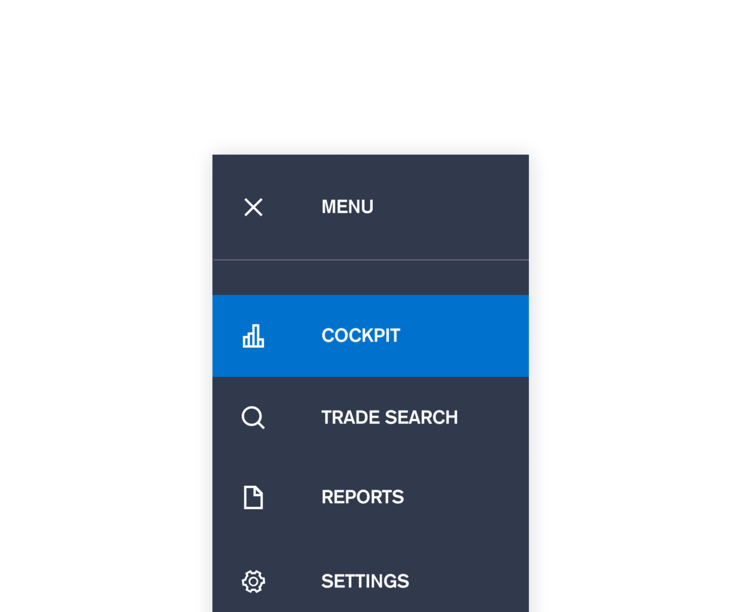
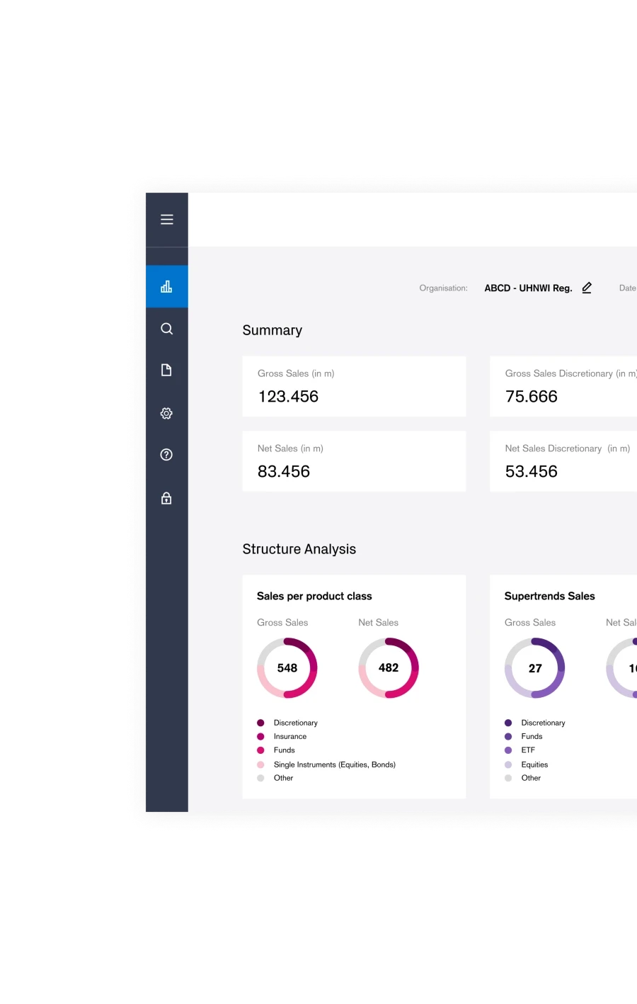
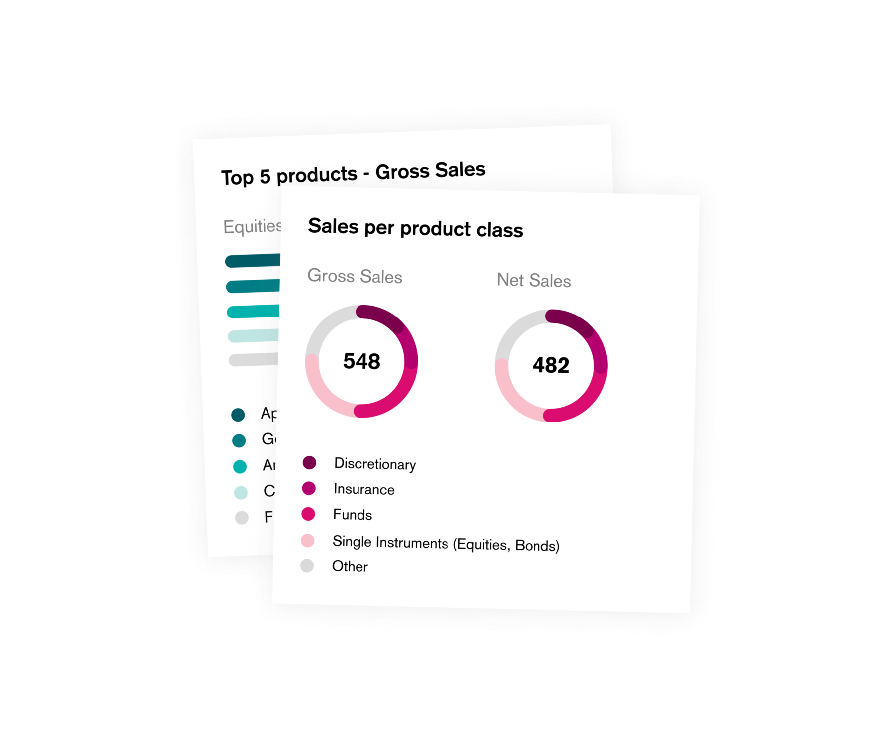
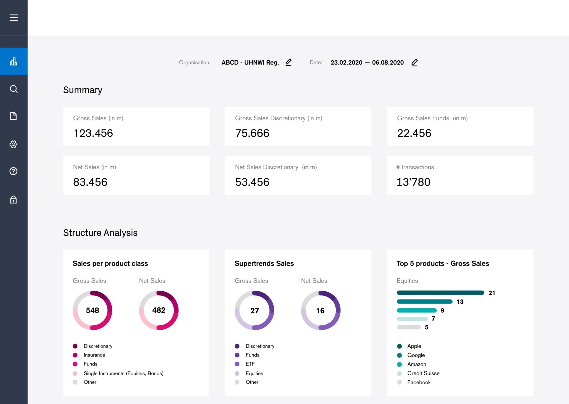
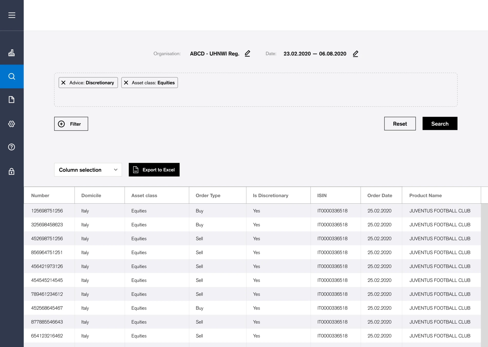
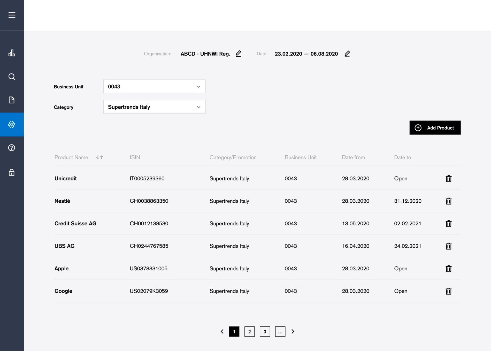
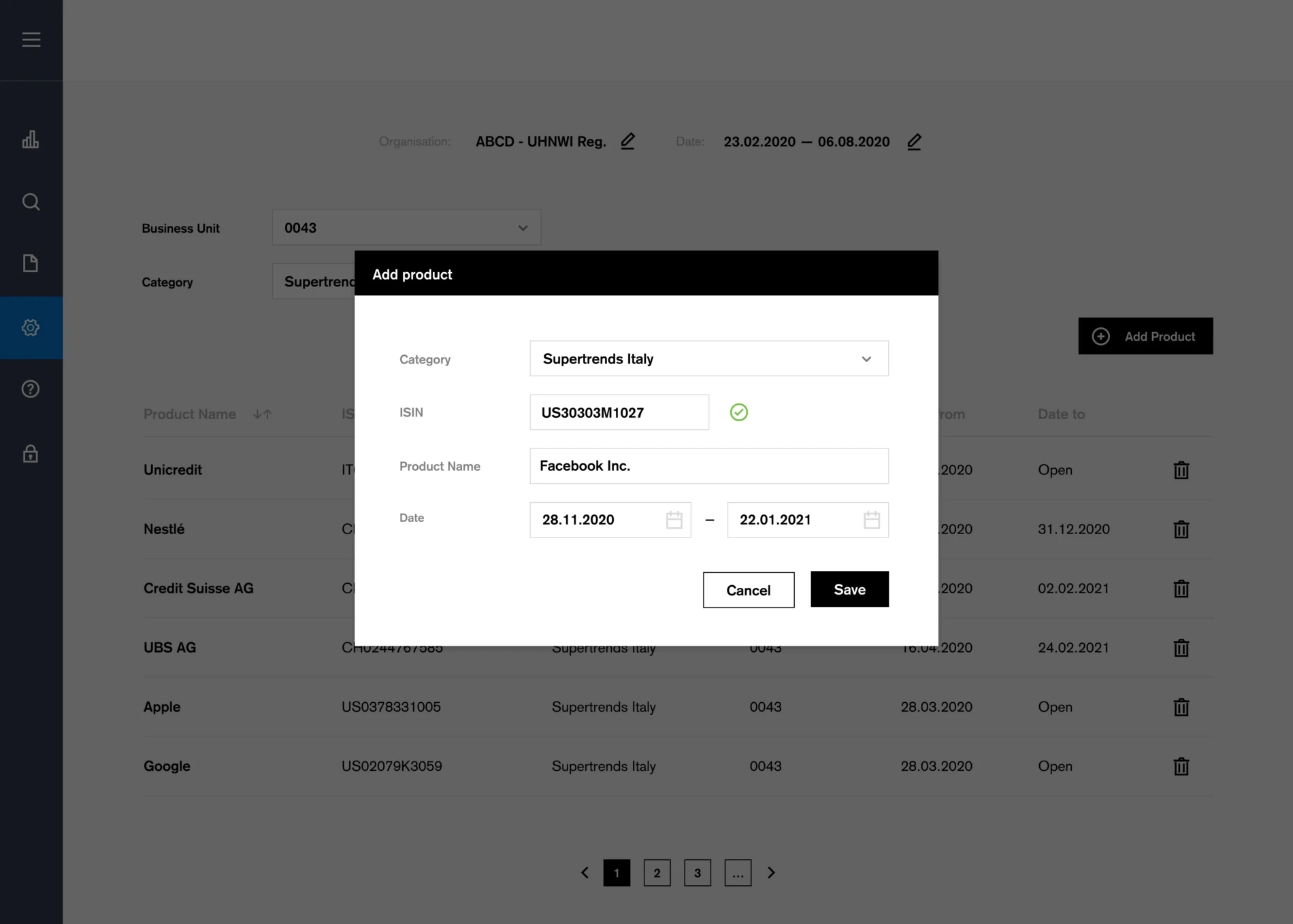
The final structure included the main element/site (dashboard), some subsites (search, downloads, settings) and an admin area. The subsites could be enabled or disabled per region or team. Since the dashboard was the main element of the tool, a design with boxes per topic was chosen, with the ability to show or hide boxes per region/team. This way, a user could also rearrange or hide boxes to customize the dashboard.
Features
Flexible design - customize dashboard
Corporate Design System
Easy to use
Filter & find quickly
Export to Excel
Disclaimer
All trademarks, names, logos and icons used in this project are proprietary to Company ABC. Figures are fictitious and for illustrative purposes only.
Client
Company ABC
Tools
Framer, Adobe XD
Role
UX/UI Designer
Year
2020 - 2022
Colors
Tags
Dashboard
Design System
Corporate
Overview
The 'Analytics Portal' project started in 2020 with the aim of replacing semi-manual sales reports in Excel prepared by relationship managers with a fully automated, scalable and aggregated web application. It was intended to begin with the most basic features (figures) and gradually add functionality of the tool over time.
Challenge
Apart from the typical "easy to use", there were very few requirements. Due to the global scope, the main requirement was flexibility: It should be possible to show/hide defined topics (modules) per region or team. In addition, the new tool should contain all the figures / KPIs from the old manual Excel reports. The design team had full responsibility for the UI.
Solution
The final structure included the main element/site (dashboard), some subsites (search, downloads, settings) and an admin area. The subsites could be enabled or disabled per region or team. Since the dashboard was the main element of the tool, a design with boxes per topic was chosen, with the ability to show or hide boxes per region/team. This way, a user could also rearrange or hide boxes to customize the dashboard.
Features
Flexible design - customize dashboard
Corporate Design System
Easy to use
Filter & find quickly
Export to Excel
Disclaimer
All trademarks, names, logos and icons used in this project are proprietary to Company ABC. Figures are fictitious and for illustrative purposes only.
Get Template